# CSS Layout

-
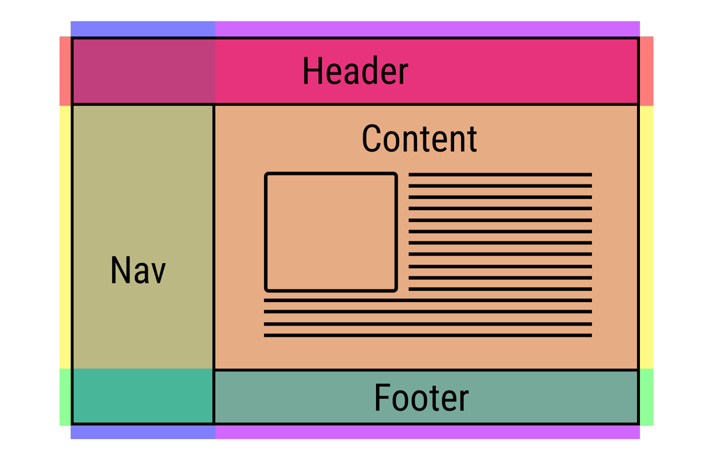
< div> elements are often used as containing elements to group together sections of a page.
-
Browsers display pages in normal flow unless you specify relative, absolute, or fixed positioning.
-
The float property moves content to the left or right of the page and can be used to create multi-column layouts. (Floated items require a defined width.)
-
Pages can be fixed width or liquid (stretchy) layouts.
-
Designers keep pages within 960-1000 pixels wide, and indicate what the site is about within the top 600 pixels (to demonstrate its relevance without scrolling).
-
Grids help create professional and flexible designs.
-
CSS Frameworks provide rules for common tasks.
-
You can include multiple CSS files in one page

HTML Layout Techniques
There are four different techniques to create multicolumn layouts. Each technique has its pros and cons:
1. CSS framework
2. CSS float property
3. CSS flexbox
4. CSS grid
CSS Frameworks
If you want to create your layout fast, you can use a CSS framework, like W3.CSS or Bootstrap.
CSS Float Layout
It is common to do entire web layouts using the CSS float property. Float is easy to learn - you just need to remember how the float and clear properties work. Disadvantages: Floating elements are tied to the document flow, which may harm the flexibility

CSS Flexbox Layout
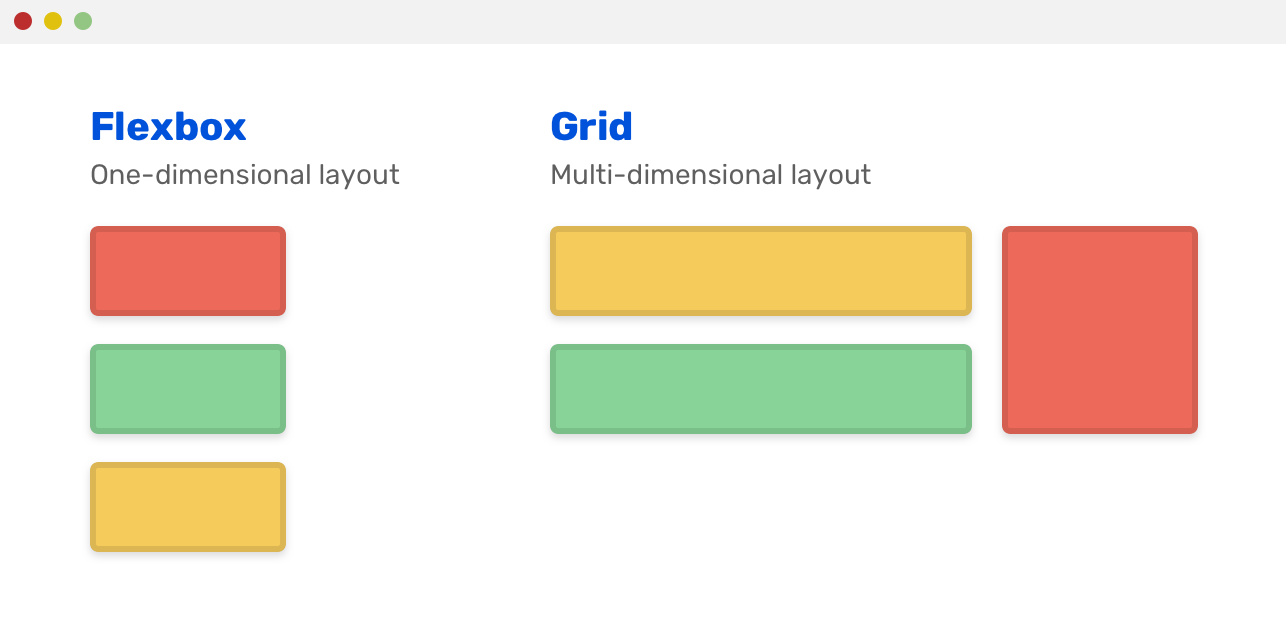
Use of flexbox ensures that elements behave predictably when the page layout must accommodate different screen sizes and different display devices.

CSS Grid Layout
The CSS Grid Layout Module offers a grid-based layout system, with rows and columns, making it easier to design web pages without having to use floats and positioning.
